Ugly Sweater Club.
Embracing imperfections
Goal: Create an online store that reflects the unique character of the brand — ironic, raw, and experimental — without sacrificing usability and conversion.
Ugly Sweater Club sells its products in their showroom in Saint-Petersburg and occasionally in concept stores in Europe and Japan. In order to grow, they needed a global brand touchpoint that would tell their story and allow selling garments outside of the showrooms.
Research
Before making any designs, I had several workshops with the brand founder. They helped me create a deeper understanding of the project:
- How does this website fit in the overall brand experience?
- What is the brand platform and the target audience of Ugly Sweater Club?
- Who will edit the website content after it's developed, and how often?
This helps me think through the life of the website after the handoff — how to establish a system convenient for the future editors depending on their experience with web.
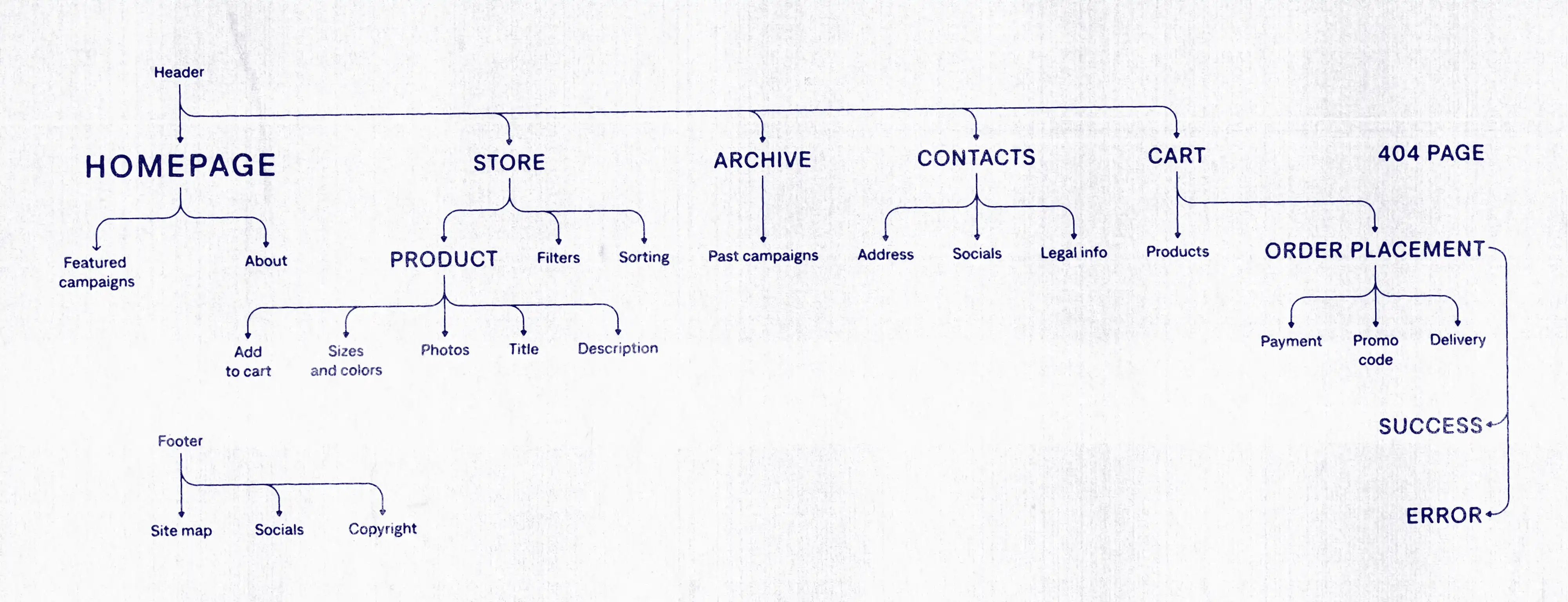
Based on received insights, I created a website map and wireframes — with project's tight timing, this allowed settling with the final structure before starting the design, decreasing the number and time-cost of future edit requests.
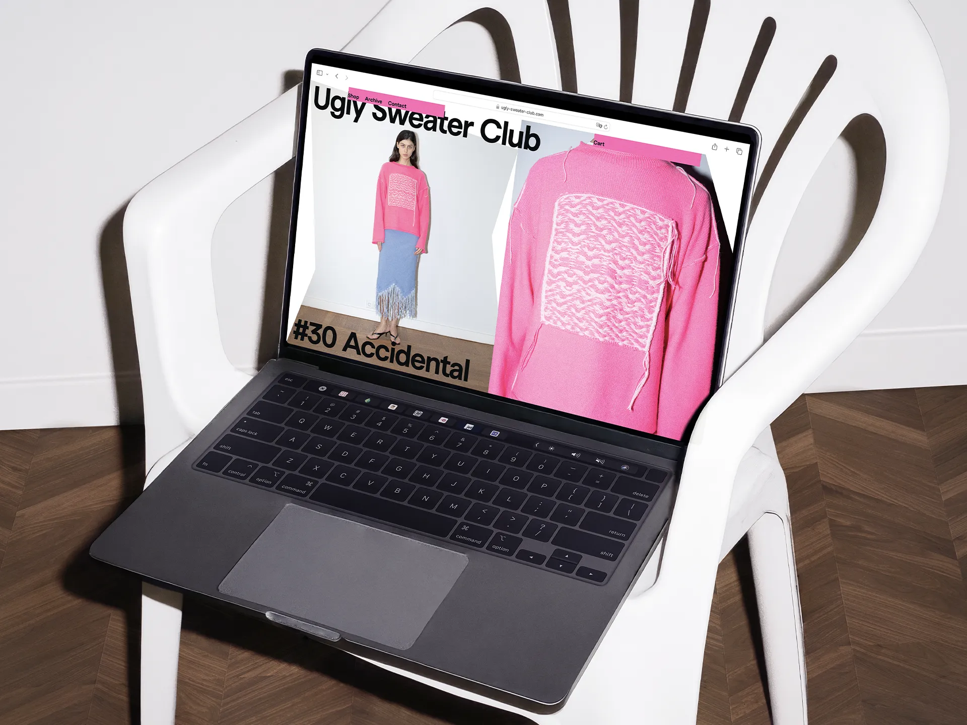
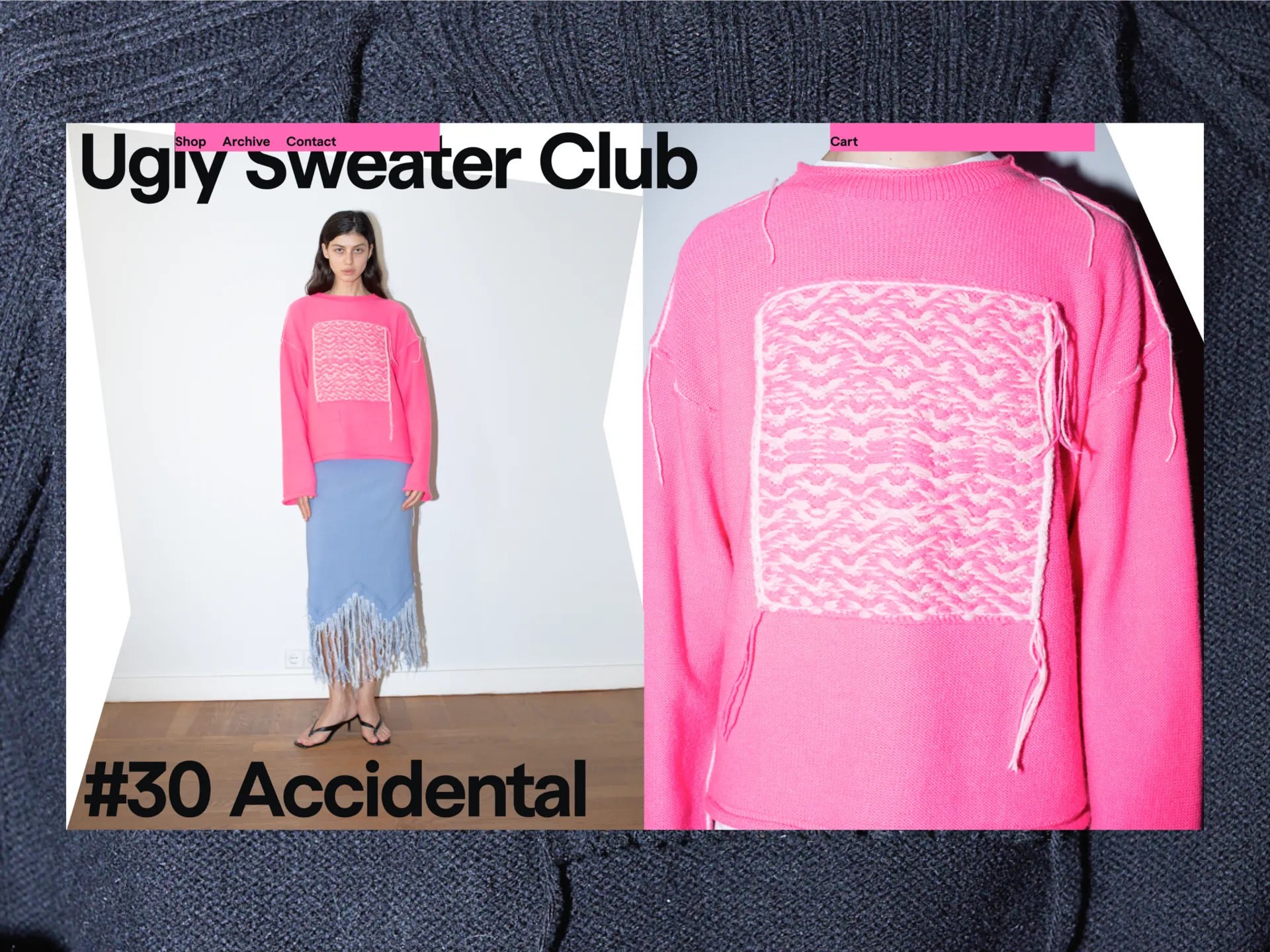
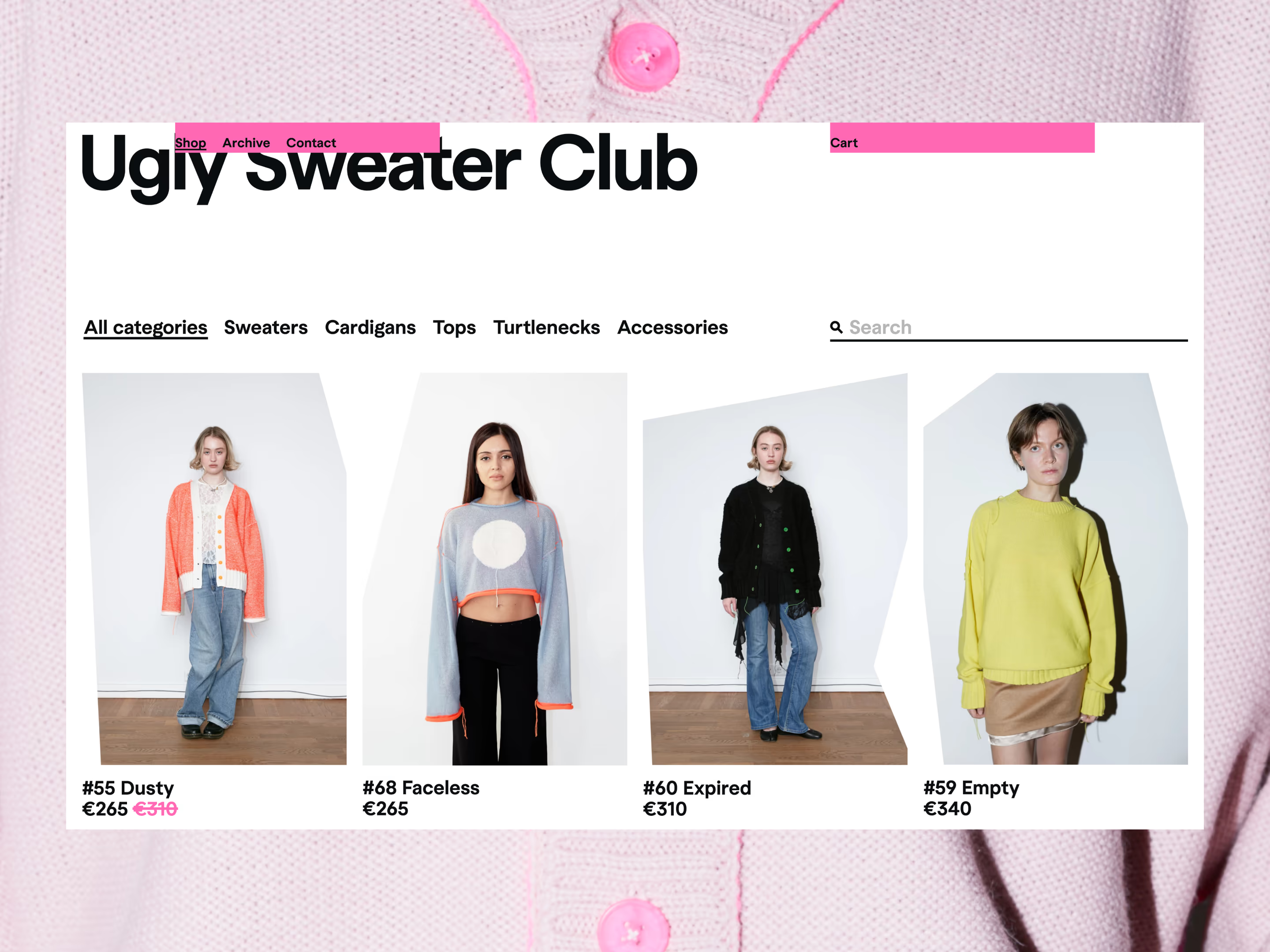
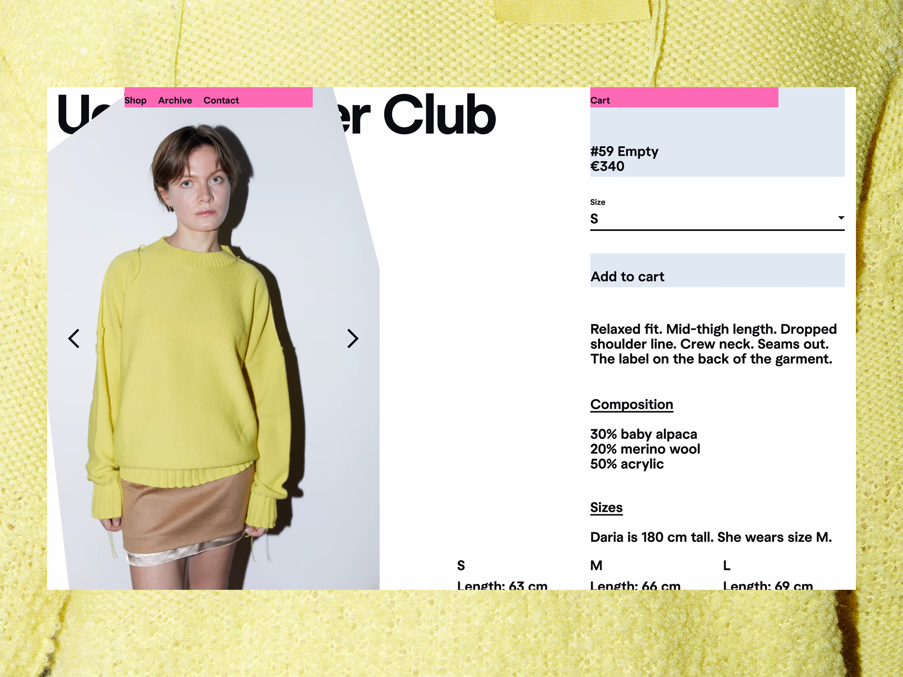
Solution: A functional website that was uglified by breaking the styling.
After the userflow was engineered, I moved on to the visual research. The brand's rawness couldn’t be faked, it had to come from a playful process. So, I built a neat, functional site — and then deliberately broke its styling. We called this process "uglification".
What is usually unnoticeable became huge, header hanged like sticking yarn, and elements layered and sticked to each other. One of the main techniques — sloppy cropped photos — was taken from the brand team's workflow shots.
This approach is an example of my favourite method of work — performative design: when the process itself embodies the concept.
Development: Tilda website for easy administration, modified CSS for brand consistency.
Based on the team's preferred payment and delivery system, as well as the need for easy content management, it was decided to build the website on Tilda.
We wrote header and footer in HTML code and modified the basic blocks set using CSS code, which is applied to the entire site — so that the team can independently build new pages or change the structure.
Impact:
A e-commerce that perfectly translated the brand, became an international selling point, and even impacted the rest of the visual identity.
- Website was built in 2 weeks
- The visual principles are now being reused for newsletter and other brand items