Viewst.
Breathing life into ad production tool.
Katya Sikacheva — Creative director
Sonya Tsotseria — Producer
Goal: Rebrand a product most people underestimate — so advertising design teams see what it really does.
The market Viewst operates on is crowded and growing double-digit a year, packed with names like Celtra, Bannerflow, and Creatopy competing for the same design teams(1). In a field like that, looking like a forgettable utility is expensive: teams don't hand their brand to a utility. They subscribe to something they trust.
So the brief wasn't cosmetic. It was to build an identity — across every channel a team might meet Viewst on — that makes the product's real value legible at a glance, and makes it feel like something you'd want to work inside.
(1): Creative Automation Platform Market report, DataIntelo — category growth and the competitive field (link)
Research: Workshops revealed that the value Viewst offered was actually bigger than the founder realised.
I started with a long look at the market and the Viewst's position on it. At first glance, it was quite simple: the product was built on solving the ad industry's pain of having to create hundreds of banner variants(2).
But then we had a series of workshops with the team of Viewst. The founder kept describing their product as a resizer, when I realised it actually wasn't.
It keeps editable layers where competitors rasterize. It does bulk content edits from a CSV — variations and translations at once. It animates where others stay static. It carries feedback and edit states as the work moves through a team. Resizing is just a tiny part of the picture, not the main differentiator.
(2): Creative Automation Platform Market report, DataIntelo — the production pain: a single launch requiring hundreds of banner variants across dozens of sizes plus localized versions (link)
Competitors treat banners as static images. Viewst treats them as something alive.
① Ads divide: one asset becomes many. ② They move: static becomes animated. ③ They evolve: feedback, edits, approval.
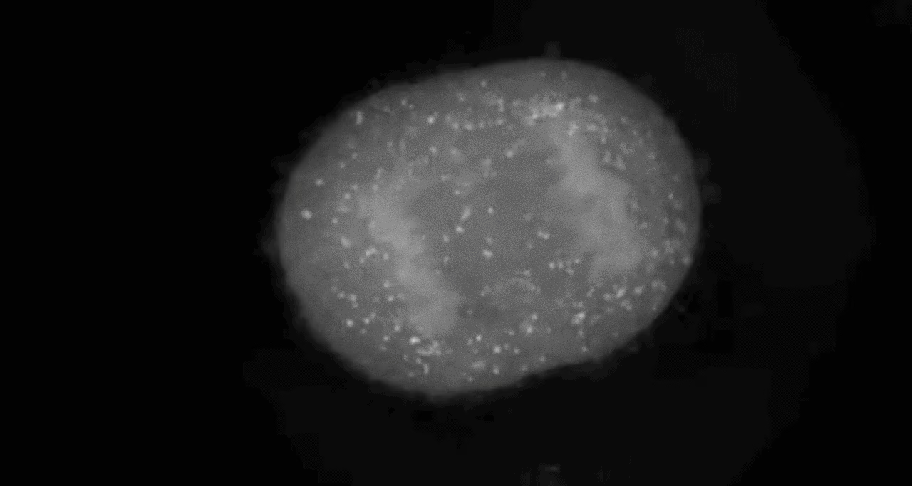
Solution: The visual identity was based on this metaphor of living cells that divide and evolve. The product's logic and selling point, made visible.
The identity never explicitly says "cell," and that's deliberate. A good concept doesn't need to announce itself. Nobody landing on the site thinks biology — they just feel that the thing is alive and easy. The metaphor generated the language; it didn't become the label.
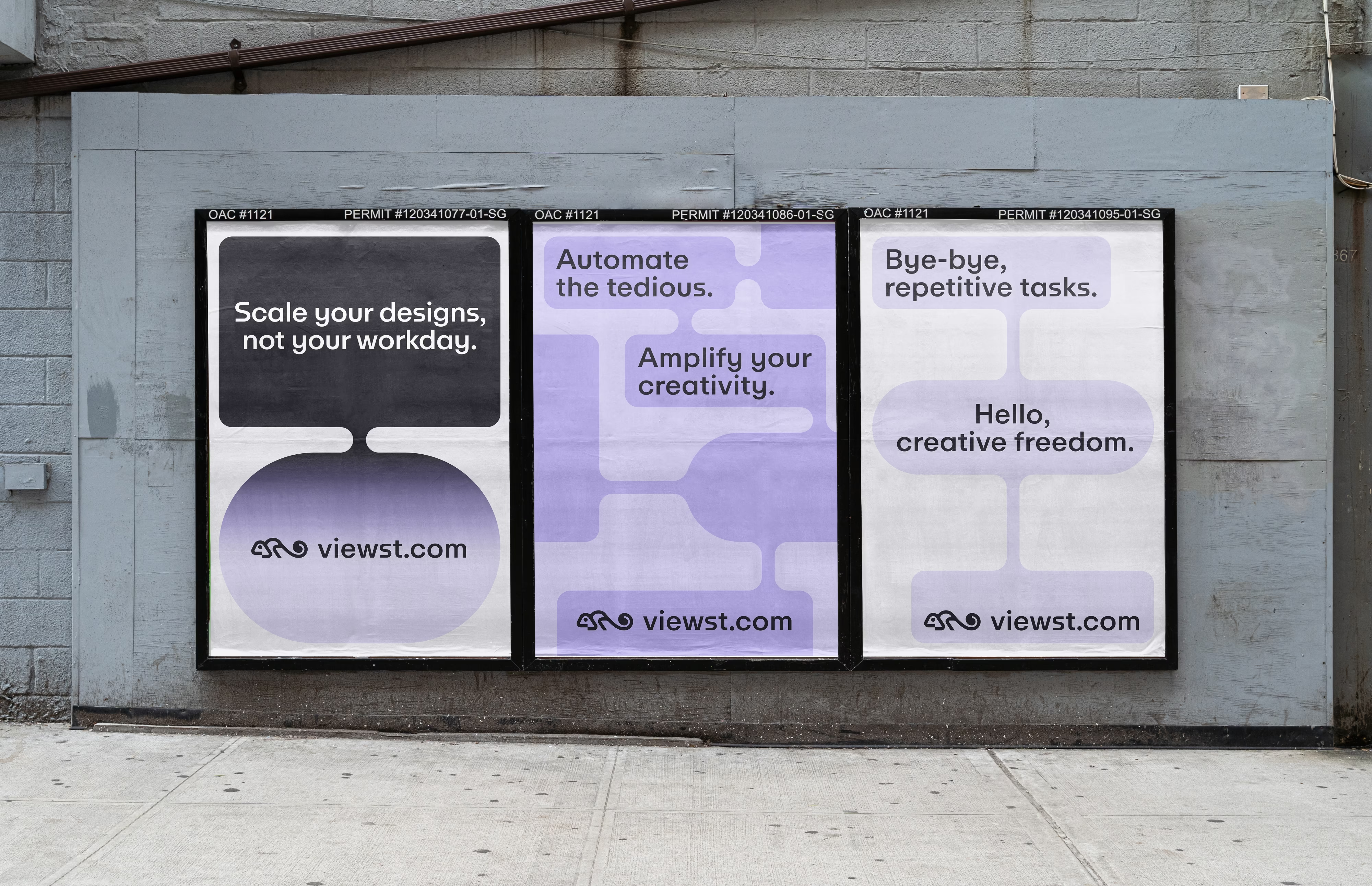
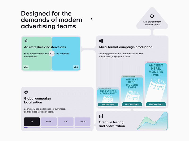
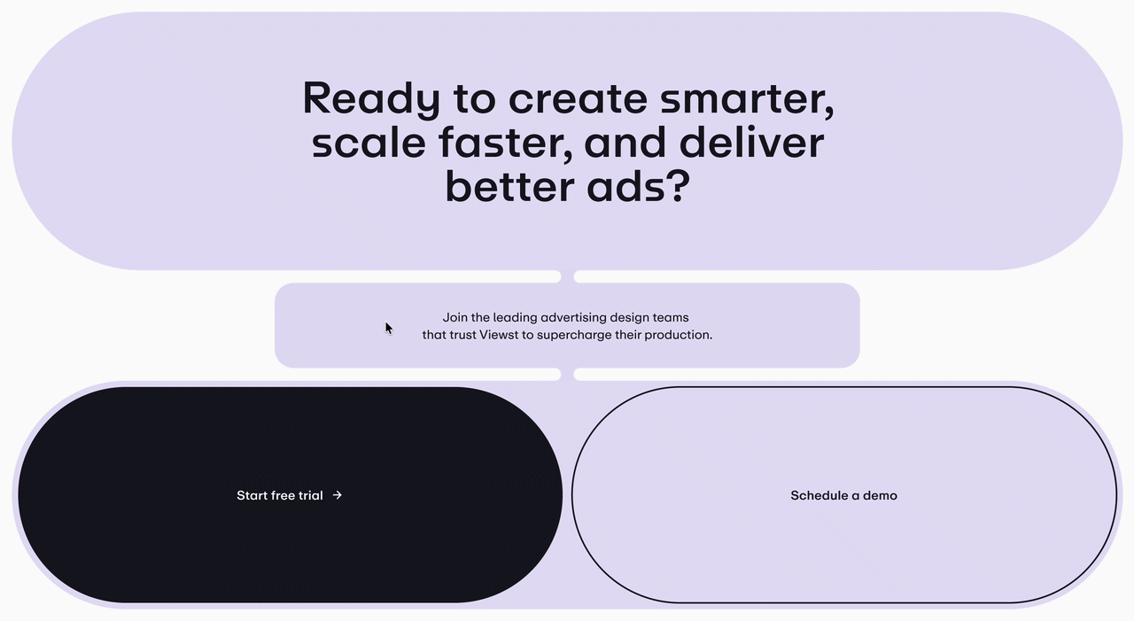
- Forms are big and rounded and merge into one another.
Shapes read as parts of one living system, not generic cards. - Motion system and microinteractions breathe life into designs and visualise the core selling point.
Growth and division as the native way things move. - A clean, rounded typeface with morphing alternates gives a unique voice.
The mechanic of the product is present even in its typography.
The anchor word was ergonomic — the convenience of a well-made tool, the softness of biological form, and plain simplicity, held in one idea. Everything followed from it.
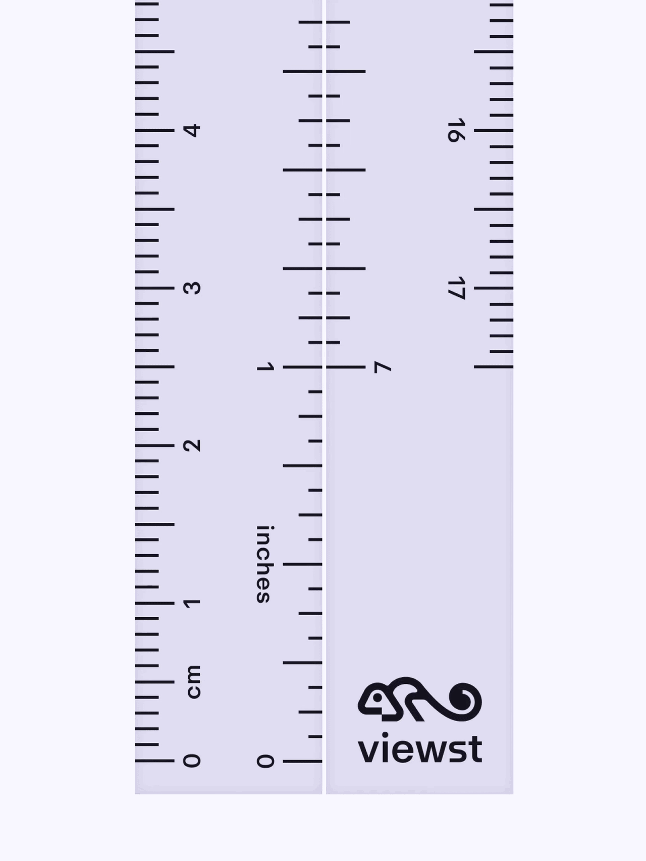
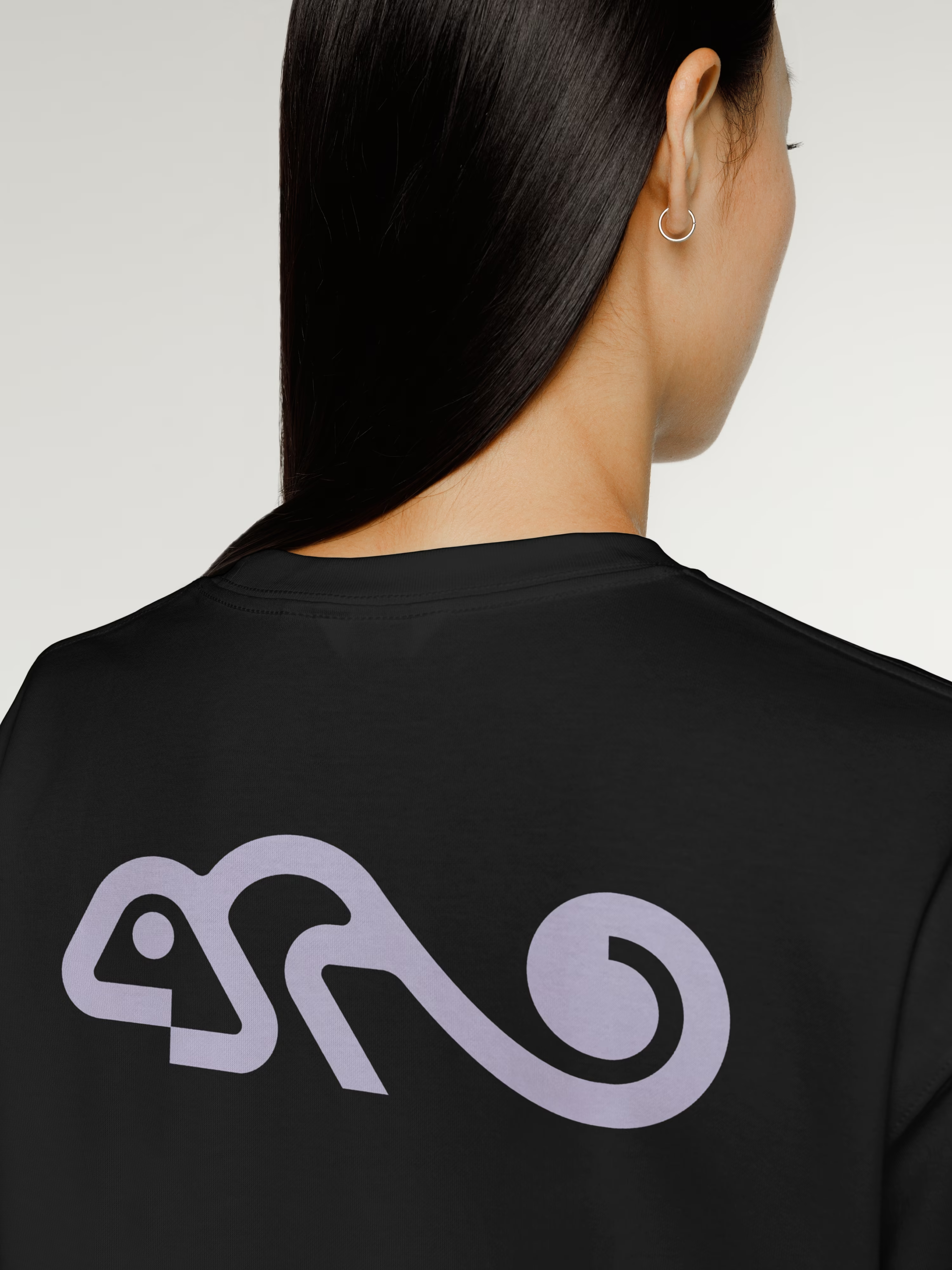
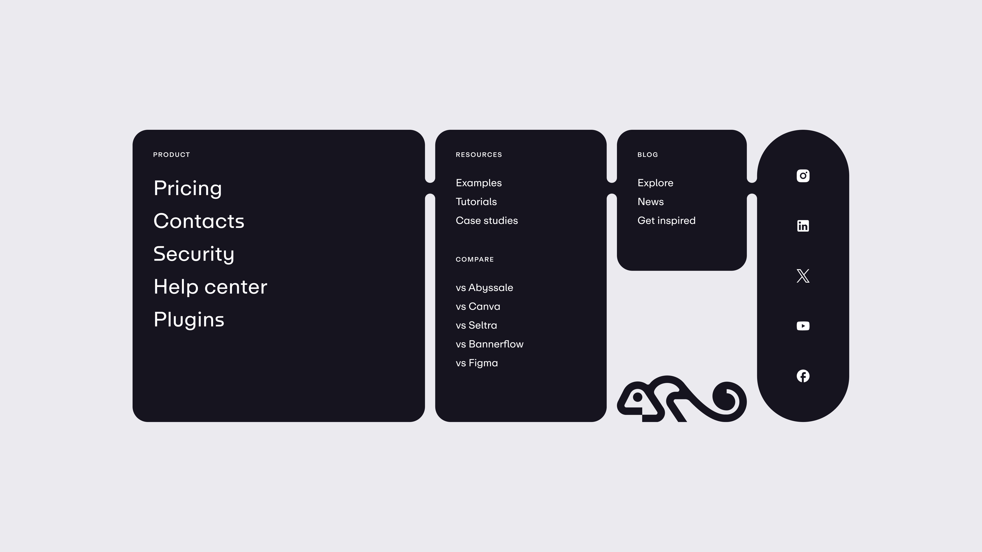
The logotype is new, but it keeps the original chameleon — a mark the client wasn't ready to part with, and didn't have to be. A redesign earns trust partly by knowing which things to keep. The chameleon carries forward; everything around it is rebuilt.
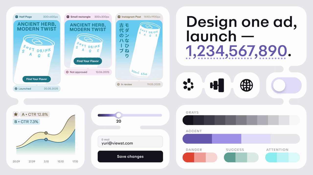
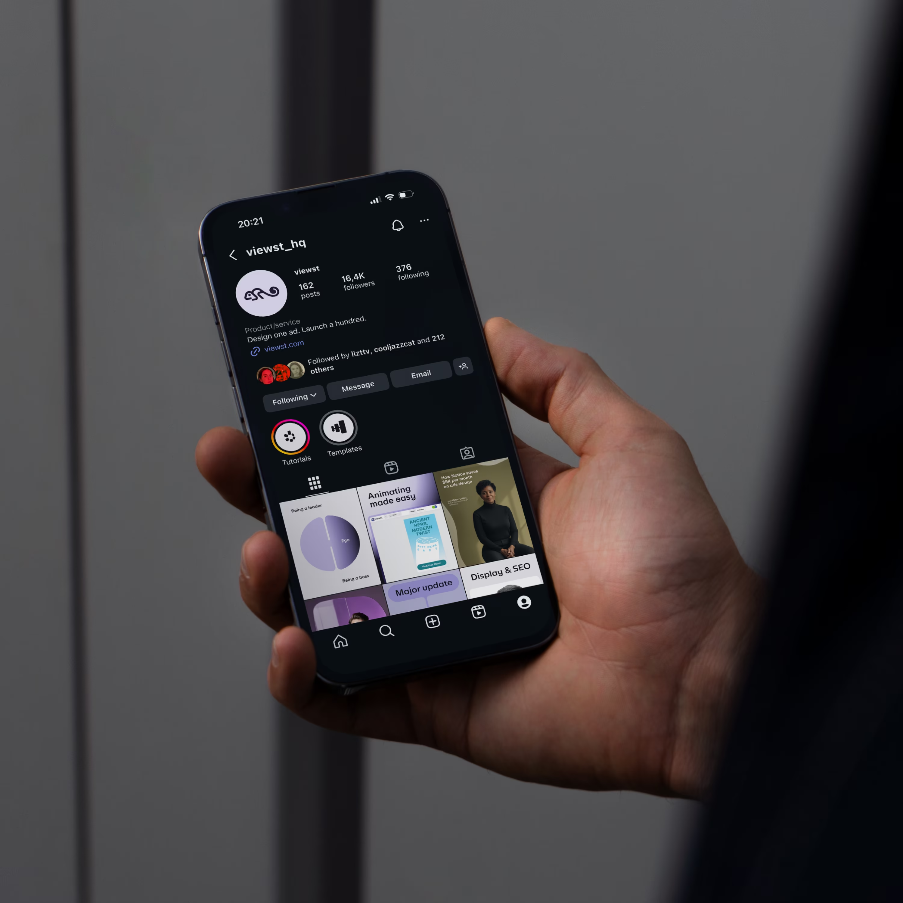
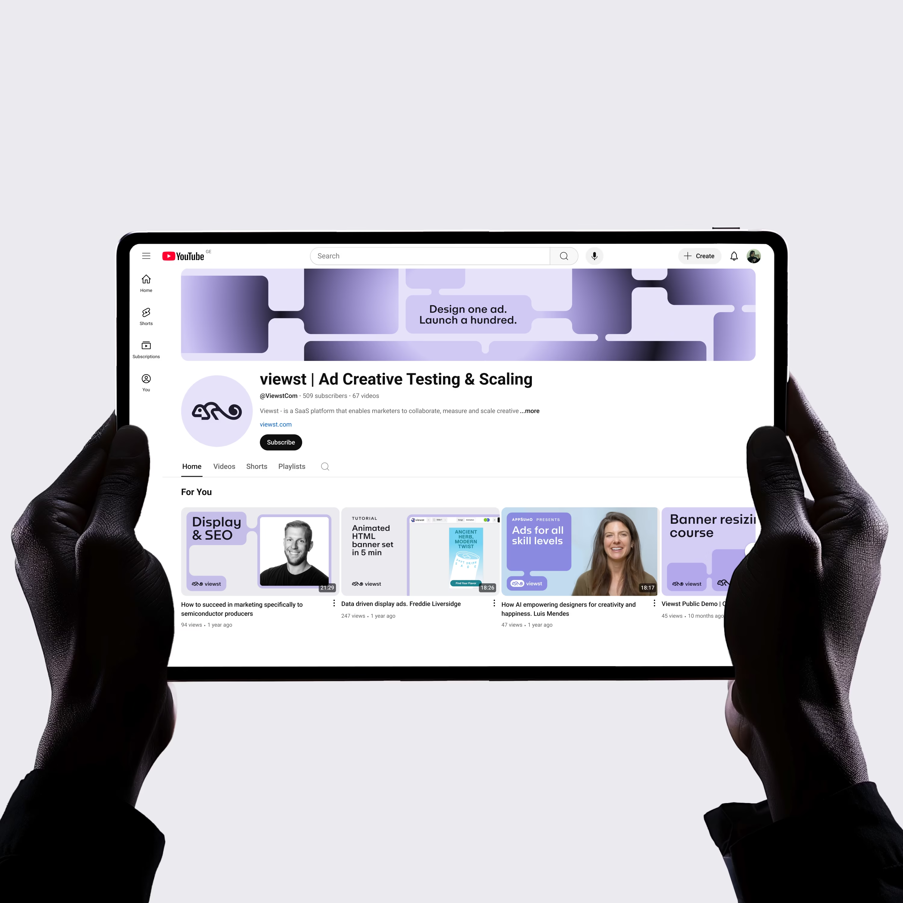
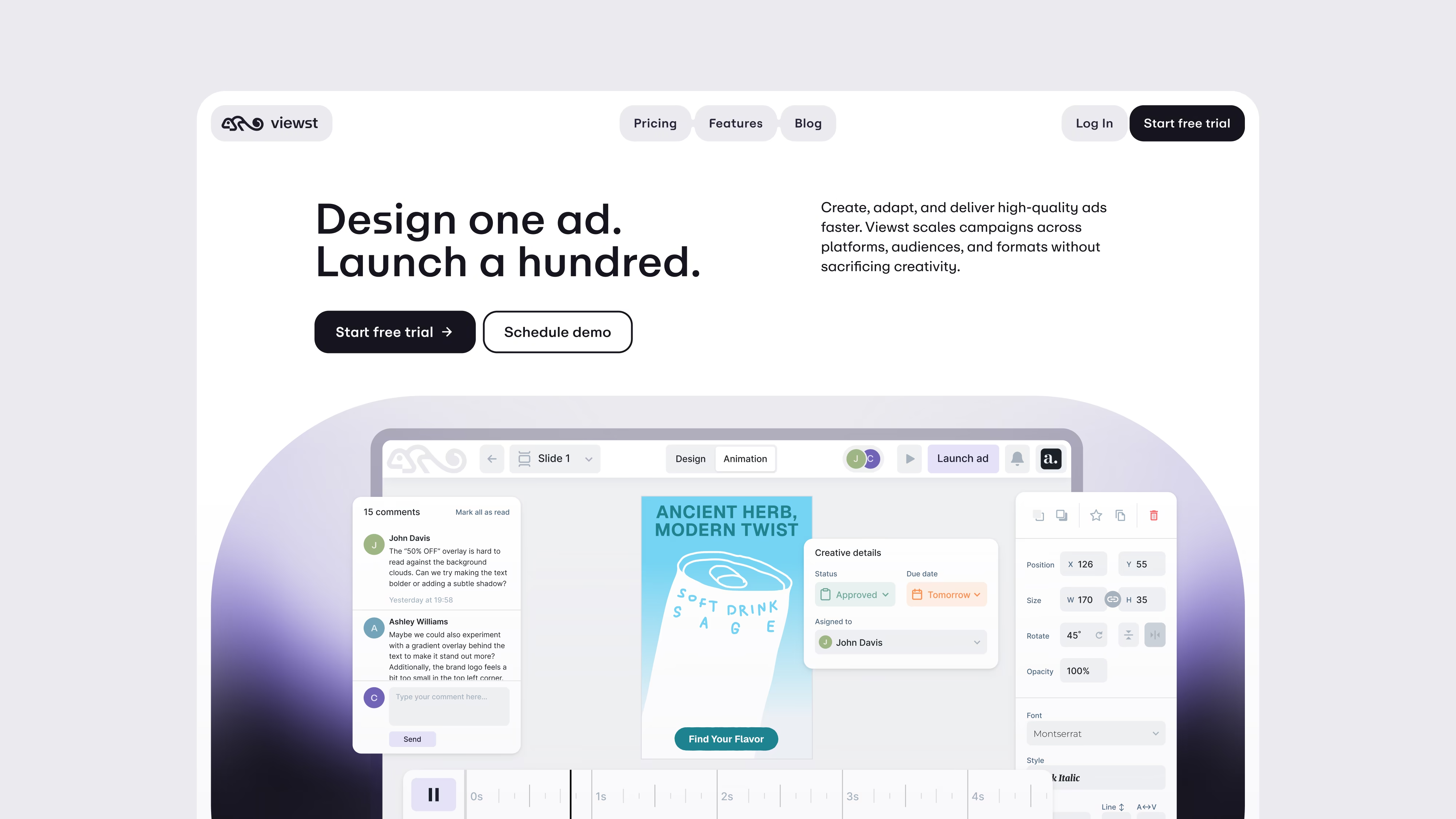
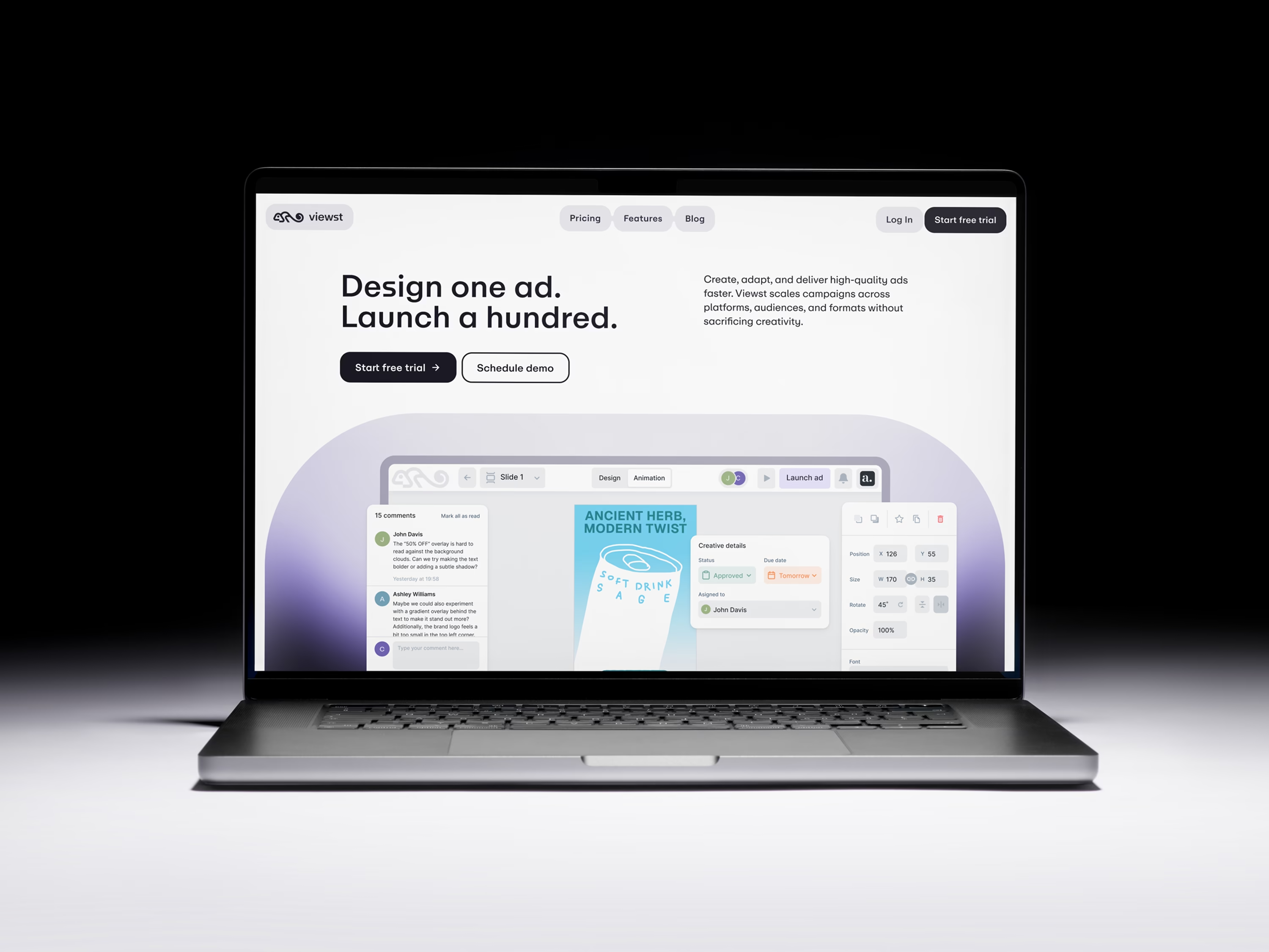
I updated the typeface and palette to match, then extended the system across every surface a team meets: the marketing site, social templates, business cards, merch, and a delivered set of principles for using the identity inside the product interface.
Development: The marketing site was designed and assembled in Framer, so the identity didn't stop at a deck — it went live as a working site.
Website features a rich set of microinteractions dictated by the visual identity. Custom-written React components allowed the product team to experiment with structure and create new blocks without breaking the identity.